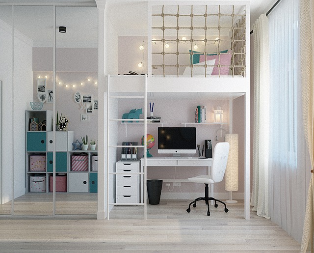
-Kid’s rooms often do triple duty as places to sleep, to play and for older kids, to do their homework. Color can play an important role in setting the scene for both resting and being productive. Borlodan Painting Company, has been bringing expert skill to all phases of painting projects, including the best colors to choose, since 2011. The Templeton painter and team take pride in being involved in every state of a painting project from helping choose the right colors to a finished project and leaving a clean work site.
“The right color can create a harmonious environment for restful sleep and productive study sessions,” says owner George Borlodan. “Let’s take a look at the best paint colors for achieving this balance and why each color is recommended.”
- Soft, soothing blue: Blue is often associated with calmness and relaxation, making it an ideal choice for promoting a good night’s sleep. Soft shades of blue, like pale sky or baby blue, create a serene atmosphere that can help you unwind after a long day. The color blue also has been shown to lower blood pressure and heart rate, which is perfect for those trying to get some quality shut-eye. For studying, blue’s calming effect can also help reduce stress and anxiety, making it easier to focus on your work.
- Muted green: Green is another color that can strike a balance between sleep and study. Muted, earthy green tones, such as sage or olive, create a connection to nature and evoke feelings of tranquility. Green is often associated with growth and renewal, which can help you stay motivated while studying. Additionally, green is known for its restorative qualities, making it an excellent choice for promoting restful sleep.
- Warm, neutral gray: Gray may seem like a dull choice, but when used wisely, it can be incredibly versatile. A warm, neutral gray can provide a soothing backdrop for sleep while maintaining an elegant and sophisticated atmosphere for studying. Gray is also known for its ability to blend seamlessly with other colors, making it easy to incorporate into your room’s decor and create a cohesive look. “Gray tones are also very versatile because they match well with other paint colors,” says the Templeton painter.
- Soft lavender: Lavender is a color that embodies both relaxation and creativity. Its gentle, muted tones can create a calming atmosphere that’s perfect for bedtime. Lavender is also associated with improved concentration and mental clarity, making it an excellent choice for studying. It’s worth noting that lavender can have a more pronounced effect on some individuals, so it’s essential to choose a shade that feels right for you.
- Pale pink: Soft, pastel shades of pink can create a tranquil and nurturing environment. While pink is often associated with femininity, it can be used in a way that appeals to both genders. Pale pink is known for its soothing qualities, making it conducive to a good night’s sleep. It can also stimulate feelings of warmth and comfort, which can enhance your focus and motivation during study sessions.
- Taupe: Taupe is a warm, earthy color that falls between brown and gray. It offers a balanced and calming presence in a room. Taupe provides a neutral backdrop that can work well with various decor styles and furniture choices. It’s versatile enough to create a soothing sleeping environment while still maintaining a clean and organized space for studying.
“When choosing a paint color for a room where you’ll be both sleeping and studying, it’s essential to consider your personal preferences, too,” says the Templeton painter. Other considerations include the size of the room and the amount of natural light it receives. Additionally, you can use accents like curtains, bedding, and wall art to complement the paint color and add character to the space.
Ultimately, the perfect color choice is a personal decision, but knowing how color can influence moods helps you create a harmonious environment that promotes both restful sleep and productive studying.
Borlodan Painting has the experience and personal touch that is needed to meet the unique needs of growing families and communities. From preserving the traditional interior and exterior appearances of historic homes and commercial buildings to new and modern construction, the professional crew at Borlodan serves California’s Central Coast respectfully, fairly and quickly.
The team knows which brands of paint stand up to the local weather and temperature fluctuations. Using only low-VOC paint, the team’s detailed work, including on doors, windows, trim and shutters is second to none.
Borlodan Painting Company is the trusted Central Coast company, committed to providing a respectful, smoke-free work site while we are on the job. We treat both the inhabitants and the spaces we paint with the utmost respect, working for results and customer satisfaction.

