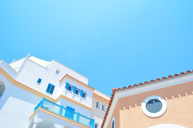
–Choosing a color scheme for commercial buildings doesn’t have to be limited to variations of neutral eggshell, or even to the same color palette for multiple buildings. Color can be used to convey important characteristics about your business and George Borlodan, Paso Robles painter and owner of Borlodan Painting, has some tips to help business owners, architects, and commercial builders decide on a color scheme.
Color follows trends and the trending colors for home and fashion may not be the appropriate primary color for a commercial building, but there are few reasons why popular or favorite colors can’t be used for signage, trim or accent colors.
The right exterior colors make a business easier to locate and add street appeal that makes people want to stop in. Once inside, use interior color to communicate the desired effect. Soft, calming colors would be appropriate for a health care office and brighter colors might be the perfect background for merchandise in a gift store. There is usually much more freedom for interior colors than for business exteriors.
Choosing a primary color
For the primary color first consider:
- Where is the building located? If it is among other commercial buildings it is probably a good idea to keep the primary color within the palette of the existing buildings. This doesn’t mean that the color can’t go past either end of that range it just means that it might take a little more time to choose the right colors.
- The tendency is to paint all the buildings in a commercial campus the same color. But, there is no law (except perhaps for building codes or landlord requirements) that says this must be so. A mix of complementary colors can be very effective.
- What is the architecture? Designs following historic architecture might be better using more traditional colors. Some pops of color might work better for a high-tech design. A multi-business commercial complex that houses a mix of retail, restaurants, and offices may be more successful with color variations.
Other considerations
Other considerations include:
- Different materials require different formulations of paint. The same color can look different on wood than it does on masonry because texture adds different nuances to color than does a flat surface. Also, keep in mind that some very unique effects can be achieved by combining different materials and colors.
- Choose colors that complement the landscaping. For example, when trees are full in the spring and summer one color might seem perfect, but when the leaves have dropped, that color might not be working. Choose colors that are going to work with all the seasons.
- The size of the building is a factor. That tall red building might be the perfect landmark, but what does it say about your business?
The psychology of color
Which colors are more likely to attract customers? Which colors best convey what your business is about? An attorney may want to project a sense of security and trust while a restaurant might want colors that add to the ambiance of elegant dining. A toy store might get away with brighter colors than a clothing boutique.
Be adventurous
One might believe that a mission-style building with a red tile roof can’t be painted green, but that might depend on the hue and trim colors. An expert painter who has developed a critical eye for color is invaluable. The years of experience working with different paint formulations, surfaces, and paint color creates an intuitive sense that one rarely finds in the paint store or by asking friends.
Borlodan Painting has been providing quality residential and commercial painting to the California Central Coast since 2005. The company’s workmanship and professionalism continually garner rave reviews. Check-in with the experts before starting any painting project.
Borlodan Painting
2197 Bel Air Place
Paso Robles, CA 93446
(805) 295-0194
This press release is by Paso Robles online marketing company Access Publishing, 806 9th Street, #2D, Paso Robles, CA 93446, (805) 226-9890.

